Card
Integrate information in a card container.
Basic usage
Card includes title, content and operations.
Card is made up of header, body and footer. header and footer are optional, and its content distribution depends on a named slot.
Simple card
The header part can be omitted.
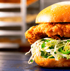
With images
Display richer content by adding some configs.
The body-style attribute defines CSS style of custom body.
Shadow
You can define when to show the card shadows
The shadow attribute determines when the card shadows are displayed. It can be always, hover or never.
API
Attributes
| Name | Description | Type | Default |
|---|---|---|---|
| header | title of the card. Also accepts a DOM passed by slot#header | string | — |
| footer 2.4.3 | footer of the card. Also accepts a DOM passed by slot#footer | string | — |
| body-style | CSS style of card body | object | — |
| header-class 2.9.8 | custom class name of card header | string | — |
| body-class 2.3.10 | custom class name of card body | string | — |
| footer-class 2.9.8 | custom class name of card footer | string | — |
| shadow | when to show card shadows | enum | always |
Slots
| Name | Description |
|---|---|
| default | customize default content |
| header | content of the Card header |
| footer | content of the Card footer |
Source
Contributors


